Protect what matters – even after you're gone. Make a plan for your digital legacy today.
Forum Discussion
dqualms
6 months agoNew Contributor
New macOS Tahoe app icon is difficult to "read"
I find it difficult to "read" the new app icon in macOS Tahoe. The lighter parts aren't very distinguishable from the darker parts make it a messy blueish blob (when not blown up like below). All the lines crossing the image everywhere are very busy and don't add value to an image of what should be an icon representing a lock.
1 Reply
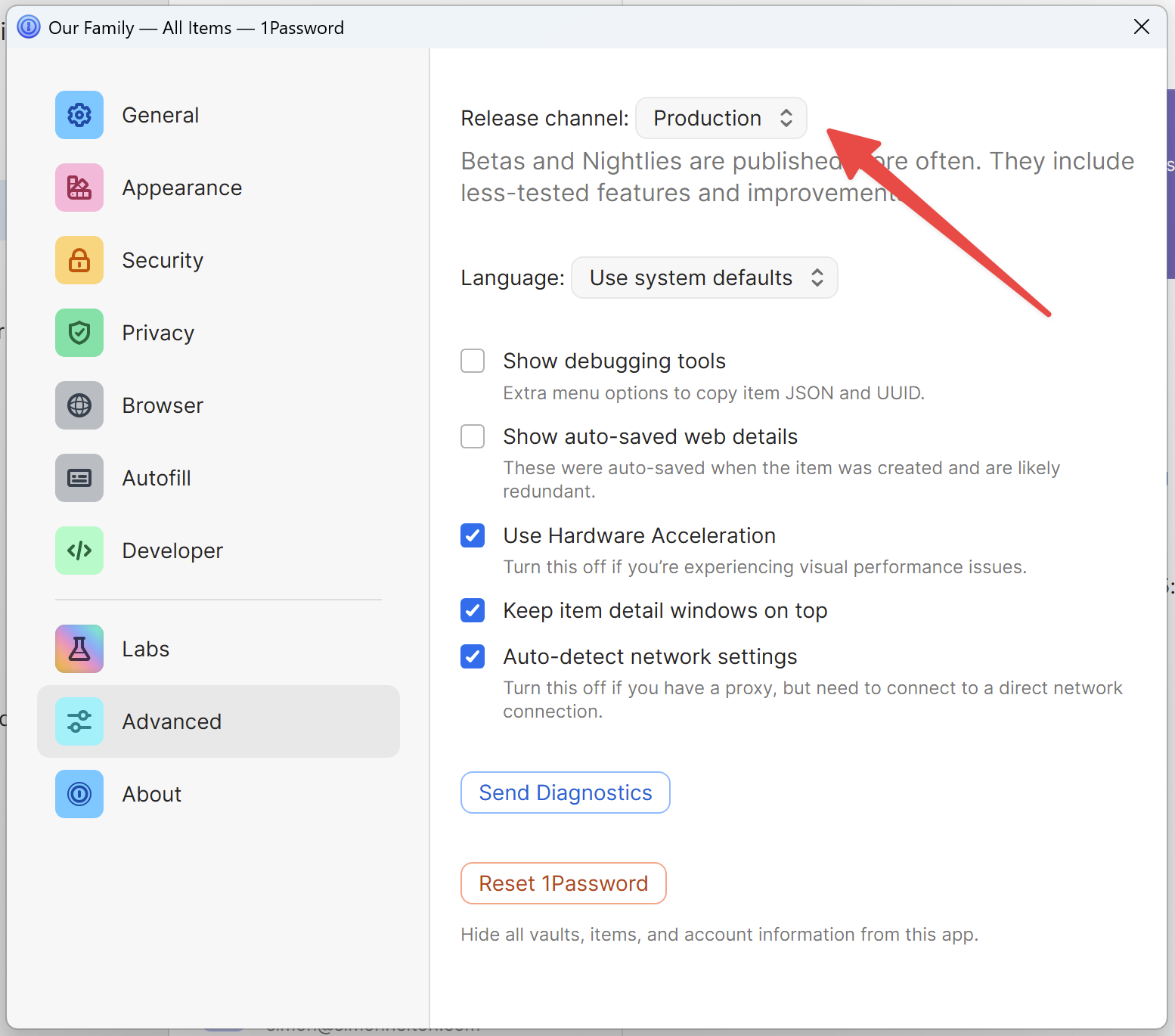
- 1P_SimonH
Community Manager
Hi dqualms,
Did you recently switch to using beta versions of 1Password? This blue icon indicates you're running a beta version of 1Password and is intended to make it clearer to users which version they're running. The regular, non-beta version ("Production") of 1Password still has the usual icon.
If you want to switch to the Production version with the familiar icon, go to Settings -> Advanced and select Production from the drop down menu at the top. Note that if you're running a beta version newer than the current Production version, 1Password won't update until a new Production version comes out and that's when the icon will go back to normal.
Let me know if anything is unclear or you have additional questions!